Python
Secure Python Without Leaving pip Behind
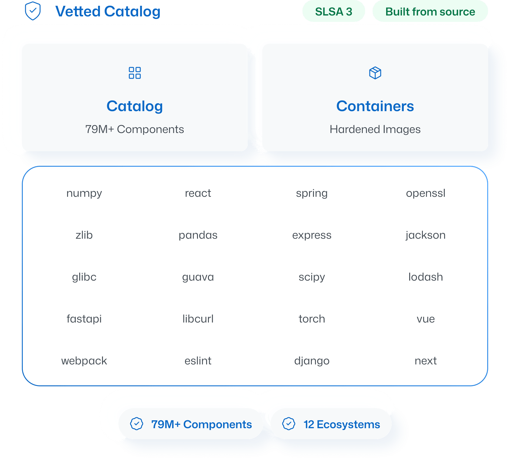
ActiveState builds Python packages from source and delivers them as native Wheels through the package managers and artifact repositories your team already uses.
%20(1).webp)
pip install still works the same way
Point pip at your Curated Catalog instead of PyPI. Every package arrives as a native Wheel, so your existing requirements files, virtual environments, and CI/CD pipelines keep working without changes.
Native Wheel format for pip, Poetry, and Pipenv
Direct integration with Artifactory, Nexus, and AWS CodeArtifact
Full compatibility with GitHub Copilot and AI coding assistants
Your data science stack, minus the CVEs
NumPy, pandas, scikit-learn, TensorFlow, and the rest of the Python data science ecosystem carry deep transitive dependency trees. ActiveState builds and tracks every layer, so your ML pipelines run on vetted code from top to bottom.
.webp)
Where Anaconda stops, ActiveState keeps going
Anaconda covers Python and R. ActiveState covers Python and 11 other language ecosystems from a single catalog, with container images and runtimes included. If your organization runs more than one language, you don't need more than one vendor.
FAQs
Does ActiveState Python work with my existing requirements.txt?
Yes. Packages are delivered as standard Wheels, so your existing requirements files, lockfiles, and virtual environments work as they always have.
What Python versions does ActiveState support?
ActiveState supports current and recent Python versions, with extended lifecycle support available for versions the community has moved past.
How is ActiveState different from PyPI?
PyPI hosts community-uploaded packages with no build verification. ActiveState builds Python packages from source in SLSA Level 3 infrastructure, with full provenance, verified licensing, and continuous remediation.
Can ActiveState replace Anaconda for my organization?
Yes. ActiveState delivers the same Python data science packages with stronger security guarantees, and covers 12+ language ecosystems compared to Anaconda's Python and R.
What about private packages alongside ActiveState packages?
Your Curated Catalog integrates with your existing artifact repository, so private packages and ActiveState packages coexist in the same registry without conflicts.
Still have questions?
Talk to our team.
See Your Python Stack at Zero CVEs
Try a free secure Python container from the ActiveState Catalog, or talk to our team about building a Curated Catalog for your Python ecosystem.
%20(1).webp)