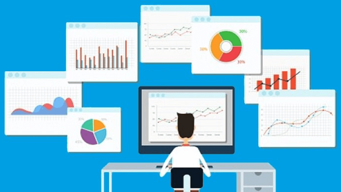
Data visualization is the graphic representation of data for the purpose of contextualizing said data. Through these visuals, we’re able to understand the significance of the data. Data visualization allows us to see trends in datasets, and gives us the ability to identify the outlying data points that often lead to useful conclusions. These are critical steps in processing data effectively. So what technologies can we use to develop effective graphic representations of large datasets?
As of today, there are several popular Python libraries for developing interactive, web-based data visualization applications. Below, I demonstrate and discuss two of these libraries: Plotly’s Dash and Bokeh.
If you want to follow along with the examples, make sure you have a recent version of Python installed along with Dash, Plotly, Bokeh and Pandas.
To get started, you can:
- Create a free ActiveState Platform account
- Download:
- ActivePython, which is a pre-built version of Python containing hundreds of packages that can help you solve your common tasks
- The “Python Dashboard” build, which contains a version of Python and most of the tools listed in this post so you can test them out for yourself.
NOTE: the simplest way to install the Python Dashboard environment is to first install the ActiveState Platform’s command line interface (CLI), the State Tool.
- If you’re on Windows, you can use Powershell to install the State Tool:
IEX(New-Object Net.WebClient).downloadString('https://platform.www.activestate.com/dl/cli/install.ps1')
- If you’re on Linux / Mac, you can use curl to install the State Tool:
sh <(curl -q https://platform.www.activestate.com/dl/cli/install.sh)
Once the State Tool is installed, just run the following command to download the build and automatically install it into a virtual environment.
state activate Pizza-Team/Python-Dashboard
Data Visualization with Dash
The two most popular frameworks for Python, Django and Flask, take incredibly different approaches to web development. Django, the older of the two frameworks, is often called a “batteries included” framework, meaning that it contains just about everything you need to launch a full featured application in no time flat. Flask, on the other hand, is a highly extensible “micro-framework” that launches with a bare minimum set of features, but has a thriving plugin ecosystem which allows developers to only include the functionality that they need to succeed.
Plotly’s Dash is a relatively new Python framework for developing interactive, web-based dashboards for data visualization. The benefits of this framework are far-reaching. The library itself was developed utilizing Plotly.js and React.js on the frontend, and leveraging the Flask web application framework on the backend.
Dash is described in their official documentation as a “pure Python abstraction around HTML, CSS and JavaScript”.This results in one particular advantage of working with Dash: you can write pure Python and allow the framework to handle the rest. This is ideal for developers who have more experience with Python than other languages, and enables these Python developers to get their data visualization solutions up and running in a relatively quick manner.
Dash does offer the flexibility for engineers to develop extensions for use with their Dash web applications. So, in the instance where a Python developer using Dash is also familiar with pure JavaScript and the React.js framework, they can comfortably develop custom Dash components to fit the needs of a particular project. This can prove to be of great use when dealing with elaborate application requirements where the standard library of Dash components doesn’t quite fill all of the needs of the application under development. What’s more, Plotly’s documentation for Dash includes a guide to help developers get started in the creation of their own Dash components utilizing React.js.
In the interest of introducing the Dash framework, I’ve developed a simple application based on a sample dataset representing high and low temperatures over time. The application will display high and low temperatures by year on a scatter plot, with the x-axis representing the year the temperature was recorded and the y-axis representing the temperatures in degrees Fahrenheit. I will also show how to add a range slider, allowing the data analyst using the app to expand or limit the years displayed by the scatter plot. In addition to Dash, I utilized the Pandas data analysis library for reading and organizing the temperature data.
Let’s get into the code:
app_dash.py
------------------
import dash
from dash.dependencies import Input, Output
import dash_core_components as dcc
import dash_html_components as html
import pandas as pd
import plotly.graph_objs as obj
app = dash.Dash(__name__)
df = pd.read_csv('C:/sample_data/tempdata.csv')
slider = dcc.RangeSlider(id='slider', value=[df['Year'].min(),df['Year'].max()], min=df['Year'].min(), max=df['Year'].max(), step=5, marks={1940:'1940',1945:'1945',1950:'1950',1955:'1955',1960:'1960',1965:'1965',1970:'1970',1975:'1975',1980:'1980',1985:'1985',1990:'1990',1995:'1995',2000:'2000',2005:'2005',2010:'2010',2015:'2015',2020:'2020'})
app.layout = html.Div(children=[
    html.H1(children='Data Visualization with Dash'),
    html.Div(children='High/Low Temperatures Over Time'),
    dcc.Graph(id='temp-plot'),
    slider
])
@app.callback(Output('temp-plot', 'figure'),
              [Input('slider', 'value')])
def add_graph(slider):
    trace_high = obj.Scatter(
                    x=df['Year'],
                    y=df['TempHigh'],
                    mode='markers',
                    name='High Temperatures')

    trace_low = obj.Scatter(
                    x=df['Year'],
                    y=df['TempLow'],
                    mode='markers',
                    name='Low Temperatures')

    layout = obj.Layout(xaxis=dict(range=[slider[0],slider[1]]),
                        yaxis={'title': 'Temperature'})

    figure = obj.Figure(data = [trace_high, trace_low], layout = layout)

    return figure
if __name__ == '__main__':
    app.run_server()
I began by importing the necessary libraries, and then proceeded to use Pandas to read and arrange my sample dataset: tempdata.csv. This dataset contains 3 columns: Year, TempHigh and TempLow, and contains entries from the years 1941 through 2018.
Next, I built my dashboard with the above code in app_dash.py. As you can see, I initialized the Dash app and defined the layout for the web page, which will contain:
- The interactive figure (graph) with two separate data traces (trace_high representing the scatter plot of high temperatures and trace_low representing the scatter plot of low temperatures)
- A RangeSlider for manipulating the plot
- Several other basic HTML elements
Lastly, it’s important to note the callback decorator on the add_graph function. This adds interactivity to our figure and demonstrates the power of Dash. The callback decorator in the above example specifies the RangeSlider as an input, and outputs the graph. The code itself takes the start-year and end-year specified by the slider and applies these constraints to the x-axis, which then outputs the updated plot for display.
A change to the specified input in the callback decorator triggers the function to fire. This functionality was straightforward to code and the slider performed well in the browser. The manipulation of the plot was fairly clean, and the figure looked and operated as expected as I modified its state with the slider component.
With the command ‘python app_dash.py’, I can run my application locally. See the screenshot below for what is displayed in the browser:

Dash provides quite a bit of interactive functionality out-of-the-box, even when developing just a simple scatter plot. These options are displayed across the top right of the figure, and include functionality for the following:
- Downloading the plot as .png
- Zooming and panning
- Options to isolate a portion of the data for analysis
- The ability to show and compare data-point attributes on hover
With the standard functionality that can be applied to each visual out-of-the-box, and the ease with which interactivity can be added to these visuals (by applying callback decorators to custom functions), it’s pretty clear that Dash provides solid value in the domain of web development for data visualization. It is a flexible framework that allows teams to quickly spin up applications for data analysis that both look good and are easily customizable.
Keep in mind that more advanced plots/charts and interactivity than I have presented in this example can be developed using Dash. In addition, it is always nice when working with a framework to be able to find a reliable source for more information and examples. In my opinion, this is a point of strength for Dash. I encourage you to check out their documentation and very active community for more detailed information about the framework, as well as more advanced code samples.
Working with Bokeh
Dash is not the only library out there for developing interactive, data visualization web applications in Python. Another framework (which has actually been around a bit longer than Dash) is Bokeh, which is one of the more well-maintained and supported libraries as evidenced by the frequent contributions to the codebase.
To demonstrate the usage of Bokeh, I developed the same sample application (high and low temperatures recorded over time) that I made using Dash. Again, I will be using Pandas to read and organize my data. Please see the code below:
app_bokeh.py
--------------------
from bokeh.io import curdoc
from bokeh.layouts import row
from bokeh.models.sources import ColumnDataSource
from bokeh.models.widgets import RangeSlider
from bokeh.plotting import figure
import pandas as pd
df = pd.read_csv('C:/sample_data/tempdata.csv')
source = ColumnDataSource(df)
rs = RangeSlider(start=1940, end=2018, step=5, value=(df.Year.min(), df.Year.max()), title = 'Year')
p = figure(plot_width=800, plot_height=400, title = 'High/Low Temperatures over Time',
       x_axis_label = 'Year', y_axis_label = 'Temperature')
p.scatter(source.data['Year'],source.data['TempHigh'], marker='square', fill_color='red')
p.scatter(source.data['Year'],source.data['TempLow'], marker='square', fill_color='blue')
def update_plot(attr, old, new):
    min_year, max_year = rs.value
    p.x_range.start = min_year
    p.x_range.end = max_year
rs.on_change('value', update_plot)
curdoc().add_root(row(rs, p))
You may find, as I did, that it takes a bit more effort at first to familiarize yourself with Bokeh’s framework. But Bokeh is very well documented, and once you get your bearings, you can move rather quickly to build a basic dashboard with some custom interactive functionality. And basic dashboards, as depicted in the above implementation of the high/low-temperature plot, can be developed in a lean manner with relatively few lines of code. In addition, once developed, the plot displayed on the web page is aesthetically pleasing, with a smooth design, and is easily manipulated within the browser. See the screenshot below for the browser output of the above code running a local Bokeh server:

Much like Dash, Bokeh provides convenience functionality for panning, zooming and saving locally as a .png. In addition, the slider (with its interaction defined in the Python callback function update_plot) integrated reasonably well with the scatter plot for manipulation. And while this sort of simplistic functionality can be written using pure Python, Bokeh also allows flexibility for developing custom JavaScript callbacks defining specific interactions that lie outside the scope of the core functionality of the library.
So if the data visuals you intend to develop are especially complex, that is hardly a reason to shy away from leveraging Bokeh to build your application. Nonetheless, you should have a fair level of comfort with JavaScript (in addition to Python, obviously) if you choose to go this route.
If you wish to see more code examples using the Bokeh library, please visit their gallery on their official site. Their examples are particularly impressive and can assist any developer who wishes to further familiarize themselves with the library and stem the learning curve. In addition, after a quick scan of the samples, you’ll find that you can build a very wide variety of customizable, graphical dashboards with the functionality provided by Bokeh—a distinct positive of working with the framework.
Dash vs Bokeh: Conclusions
The need for interactive, graphical representations of data is growing. Frameworks for building applications for creating visual representations will play a key role. Dash and Bokeh represent two popular frameworks for developing web-based data dashboards in Python.
Two of the biggest positives of any library are to be well-maintained/supported, and to allow for extensive customization to fit the needs of the development team. Both of these hold true in the cases of Dash and Bokeh, leading me to believe that you can’t go wrong utilizing either option. The decision should be made with careful consideration regarding the team’s comfort with the frameworks, following a POC of each, as well as specific application needs.
- To view all the code and data mentioned in this post, you can refer to my Github repository.
- Install the State Stool on Linux or Mac:
sh <(curl -q https://platform.www.activestate.com/dl/cli/install.sh)Or install the State Tool using PowerShell on Windows:
IEX(New-Object Net.WebClient).downloadString('https://platform.www.activestate.com/dl/cli/install.ps1') - On the command line, run the following to automatically download and install the Python Dashboard runtime into a virtual environment:
state activate Pizza-Team/Python-Dashboard

Use ActivePython and accelerate your Python projects.
- The #1 Python solution used by innovative enterprise teams
- Comes pre-bundled with top Python packages
- Spend less time resolving dependencies and more time on quality coding