Before we start: This Python tutorial is a part of our series of Python Package tutorials. You can find other Matplotlib related topics too!
Pythonistas typically use the Matplotlib plotting library to display numeric data in plots, graphs and charts in Python. A wide range of functionality is provided by matplotlib’s two APIs (Application Programming Interfaces):
- Pyplot API interface, which offers a hierarchy of code objects that make matplotlib work like MATLAB.
- OO (Object-Oriented) API interface, which offers a collection of objects that can be assembled with greater flexibility than pyplot. The OO API provides direct access to matplotlib’s backend layer.
The pyplot interface is easier to implement than the OO version and is more commonly used. For information about pyplot functions and terminology, refer to: What is Pyplot in Matplotlib
Display a plot in Python: Pyplot Examples
Matplotlib’s series of pyplot functions are used to visualize and decorate a plot.
How to Create a Simple Plot with the Plot() Function
The matplotlib.pyplot.plot() function provides a unified interface for creating different types of plots.
The simplest example uses the plot() function to plot values as x,y coordinates in a data plot. In this case, plot() takes 2 parameters for specifying plot coordinates:
- Parameter for an array of X axis coordinates.
- Parameter for an array of Y axis coordinates.
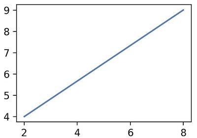
A line ranging from x=2, y=4 through x=8, y=9 is plotted by creating 2 arrays of (2,8) and (4,9):
import matplotlib.pyplot as plt
import numpy as np
# X axis parameter:
xaxis = np.array([2, 8])
# Y axis parameter:
yaxis = np.array([4, 9])
plt.plot(xaxis, yaxis)
plt.show()
Figure 1. A simple plot created with the plot() function:
How to Customize Plot Appearance with Marker & Linestyle
marker and linestyle are matplotlib keywords that can be used to customize the appearance of data in a plot without modifying data values.
- marker is an argument used to label each data value in a plot with a ‘marker‘.
- linestyle is an argument used to customize the appearance of lines between data values, or else remove them altogether.
In this example, each data value is labeled with the letter “o”, and given a dashed linestyle “–”:
import matplotlib.pyplot as plt
import numpy as np
xaxis = np.array([2, 12, 3, 9])
# Mark each data value and customize the linestyle:
plt.plot(xcoords, marker = “o”, linestyle = “--”)
plt.show()
A partial list of string characters that are acceptable options for marker and linestyle:
“-” solid line style
“--” dashed line style
“ “ no line
“o” letter marker
Matplotlib Scatter Plot Example
Matplotlib also supports more advanced plots, such as scatter plots. In this case, the scatter() function is used to display data values as a collection of x,y coordinates represented by standalone dots.
In this example, 2 arrays of the same length (one array for X axis values and another array for Y axis values) are plotted. Each value is represented by a dot:
import matplotlib.pyplot as plt
# X axis values:
x = [2,3,7,29,8,5,13,11,22,33]
# Y axis values:
y = [4,7,55,43,2,4,11,22,33,44]
# Create scatter plot:
plt.scatter(x, y)
plt.show()
Matplotlib Example: Multiple Data Sets in One Plot
Matplotlib is highly flexible, and can accommodate multiple datasets in a single plot. In this example, we’ll plot two separate data sets, xdata1 and xdata2:
import matplotlib.pyplot as plt
import numpy as np
# Create random seed:
np.random.seed(5484849901)
# Create random data:
xdata = np.random.random([2, 8])
# Create two datasets from the random floats:
xdata1 = xdata[0, :]
xdata2 = xdata[1, :]
# Sort the data in both datasets:
xdata1.sort()
xdata2.sort()
# Create y data points:
ydata1 = xdata1 ** 2
ydata2 = 1 - xdata2 ** 4
# Plot the data:
plt.plot(xdata1, ydata1)
plt.plot(xdata2, ydata2)
# Set x,y lower, upper limits:
plt.xlim([0, 1])
plt.ylim([0, 1])
plt.title(“Multiple Datasets in One Plot")
plt.show()
Matplotlib Example: Subplots
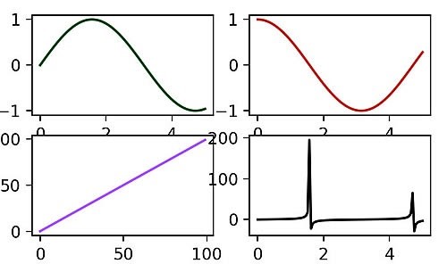
You can also use matplotlib to create complex figures that contain more than one plot. In this example, multiple axes are enclosed in one figure and displayed in subplots:
import matplotlib.pyplot as plt
import numpy as np
# Create a Figure with 2 rows and 2 columns of subplots:
fig, ax = plt.subplots(2, 2)
x = np.linspace(0, 5, 100)
# Index 4 Axes arrays in 4 subplots within 1 Figure:
ax[0, 0].plot(x, np.sin(x), 'g') #row=0, column=0
ax[1, 0].plot(range(100), 'b') #row=1, column=0
ax[0, 1].plot(x, np.cos(x), 'r') #row=0, column=1
ax[1, 1].plot(x, np.tan(x), 'k') #row=1, column=1
plt.show()
Figure 2. Multiple axe in subplots displayed in one figure:
Matplotlib Example: Histogram Plot
A histogram is used to display frequency distributions in a bar graph.
In this example, we’ll combine matplotlib’s histogram and subplot capabilities by creating a plot containing five bar graphs. The areas in the bar graph will be proportional to the frequency of a random variable, and the widths of each bar graph will be equal to the class interval:
import matplotlib.plot as plt
import matplotlib.ticker as maticker
import numpy as np
# Create random variable:
data = np.random.normal(0, 3, 800)
# Create a Figure and multiple subplots containing Axes:
fig, ax = plt.subplots()
weights = np.ones_like(data) / len(data)
# Create Histogram Axe:
ax.hist(data, bins=5, weights=weights)
ax.yaxis.set_major_formatter(maticker.PercentFormatter(xmax=1.0, decimals=1))
plt.title(“Histogram Plot”)
plt.show()
Matplotlib Example: Phase Spectrum Plot
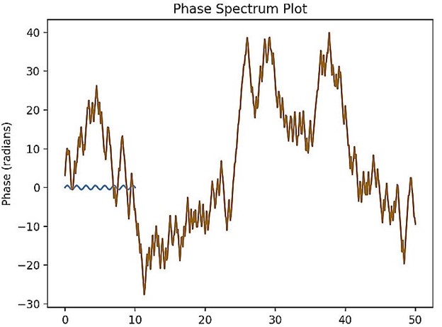
A phase spectrum plot lets us visualize the frequency characteristics of a signal.
In this advanced example, we’ll plot a phase spectrum of two signals (represented as functions) that each have different frequencies:
import matplotlib.pyplot as plt
import numpy as np
# Generate pseudo-random numbers:
np.random.seed(0)
# Sampling interval:
dt = 0.01
# Sampling Frequency:
Fs = 1 / dt  # ex[;aom Fs]
# Generate noise:
t = np.arange(0, 10, dt)
res = np.random.randn(len(t))
r = np.exp(-t / 0.05)
# Convolve 2 signals (functions):
conv_res = np.convolve(res, r)*dt
conv_res = conv_res[:len(t)]
s = 0.5 * np.sin(1.5 * np.pi * t) + conv_res
# Create the plot:
fig, (ax) = plt.subplots()
ax.plot(t, s)
# Function plots phase spectrum:
ax.phase_spectrum(s, Fs = Fs)
plt.title(“Phase Spectrum Plot”)
plt.show()
Figure 3. A Phase Spectrum of two signals with different frequencies is plotted in one figure:
Matplotlib Example: 3D Plot
Matplotlib can also handle 3D plots by allowing the use of a Z axis. We’ve already created a 2D scatter plot above, but in this example we’ll create a 3D scatter plot:
from mpl_toolkits.mplot3d import Axes3D
import matplotlib.pyplot as plt
fig = plt.figure()
# Create 1 3D subplot:
ax = fig.add_subplot(111, projection='3d')
# ‘111’ is a MATlab convention used in Matplotlib
# to create a grid with 1 row and 1 column.
# The first cell in the grid is the new Axes location.
# Create x,y,z coordinates:
x =[1,2,3,4,5,6,7,8,9,10]
y =[11,4,2,5,13,4,14,2,4,8]
z =[2,3,4,5,5,7,9,11,19,9]
# Create a 3D scatter plot with x,y,z orthogonal axis, and red "o" markers:
ax.scatter(x, y, z, c='red', marker="o")
# Create x,y,z axis labels:
ax.set_xlabel('X Axis')
ax.set_ylabel('Y Axis')
ax.set_zlabel('Z Axis')
plt.show()
How to Use a Matplotlib Backend
Matplotlib can target just about any output format you can think of. Most commonly, data scientists display plots in their Jupyter notebook, but you can also display plots within an application.
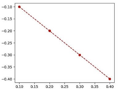
In this example, matplotlib’s OO backend uses the Tkinter TkAgg() function to generate Agg (Anti-Grain Geometry) high-quality rendering, and the Tk mainloop() function to display a plot:
from tkinter import *
from tkinter.ttk import *
import matplotlib
matplotlib.use("TkAgg")
from matplotlib.figure import Figure
# OO backend (Tkinter) tkagg() function:
from matplotlib.backends.backend_tkagg import FigureCanvasTkAgg
root = Tk()
figure = Figure(figsize=(5, 4), dpi=100)
plot = figure.add_subplot(1, 1, 1)
x = [ 0.1, 0.2, 0.3, 0.4 ]
y = [ -0.1, -0.2, -0.3, -0.4 ]
plot.plot(x, y, color="red", marker="o",  linestyle="--")
canvas = FigureCanvasTkAgg(figure, root)
canvas.get_tk_widget().grid(row=0, column=0)
root.mainloop()
Figure 4. An OO backend plot displayed using Tkinter tkagg() function:
Final Tip: matplotlib script execution creates a text output in the Python console (not part of the UI plot display) that may include warning messages or be otherwise visually unappealing. To fix this, you can add a semicolon (;) at the end of the last line of code before displaying the plot. For example:
 # pyplot scatter() function:
plt.scatter(x, y);
 plt.show()
The following tutorials will provide you with step-by-step instructions on how to work with Matplotlib, including:
Why use ActivePython for Data Science
While the open source distribution of Python may be satisfactory for an individual, it doesn’t always meet the support, security, or platform requirements of large organizations.
This is why organizations choose ActivePython for their data science, big data processing and statistical analysis needs.
Pre-bundled with the most important packages Data Scientists need, ActivePython is pre-compiled so you and your team don’t have to waste time configuring the open source distribution. You can focus on what’s important–spending more time building algorithms and predictive models against your big data sources, and less time on system configuration.
ActivePython is 100% compatible with the open source Python distribution, and provides the security and commercial support that your organization requires.
With ActivePython you can explore and manipulate data, run statistical analysis, and deliver visualizations to share insights with your business users and executives sooner–no matter where your data lives.
Some Popular Python Packages You Get Pre-compiled – with ActivePython for Data Science/Big Data/Machine Learning
- pandas (data analysis)
- NumPy (multi-dimensional arrays)
- SciPy (algorithms to use with numpy)
- HDF5 (store & manipulate data)
- Matplotlib (data visualization)
- Jupyter (research collaboration)
- PyTables (managing HDF5 datasets)
- HDFS (C/C++ wrapper for Hadoop)
- pymongo (MongoDB driver)
- SQLAlchemy (Python SQL Toolkit)
- redis (Redis access libraries)
- pyMySQL (MySQL connector)
- scikit-learn (machine learning)
- TensorFlow (deep learning with neural networks)
- scikit-learn (machine learning algorithms)
- keras (high-level neural networks API)
Download ActiveState Python to get started or contact us to learn more about using ActiveState Python in your organization.


